P4: Create the planned interactive product
Here is evidence of me creating relevant documents for my website
Here is evidence of me creating a template to start off the production of my website. For this, I am using Wix.
The interactive elements I am going to use are:
I will be needing a navigational bar so that the user will have access to the other pages rather than just the home screen, and it is a simple but effective interactive method of keeping the user interested in the website; rather than having the user scroll down to find the section they are looking for, they can just use the navigational bar and find it a lot easier.
The use of buttons will also be an effective interactive element as it means I can link pages from different sections in the navigational chart together.
One of the the reasons Soundcast has asked me to create the website is to sell a band's new album. But an option to buy merchandise is a good idea as it will keep the user exploring the band further and will make Sound-cast and the band profit from the purchases.
Seeing images and being able to interact with images may result in the users getting to know the band more or possibly recognising them.
- Navigational bar Buttons
- A store where you can buy products such as their albums, merchandise and tickets to their events.
- Images of the band
I will be needing a navigational bar so that the user will have access to the other pages rather than just the home screen, and it is a simple but effective interactive method of keeping the user interested in the website; rather than having the user scroll down to find the section they are looking for, they can just use the navigational bar and find it a lot easier.
The use of buttons will also be an effective interactive element as it means I can link pages from different sections in the navigational chart together.
One of the the reasons Soundcast has asked me to create the website is to sell a band's new album. But an option to buy merchandise is a good idea as it will keep the user exploring the band further and will make Sound-cast and the band profit from the purchases.
Seeing images and being able to interact with images may result in the users getting to know the band more or possibly recognising them.
Here is evidence of me collecting the content I need.
Here I am collecting images for my website.
Here I am setting up linking social media channels.
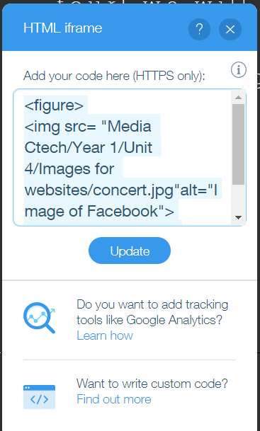
Here is evidence of me using HTML on my website. I used this html to add in an image for a news page.
Here is the process of me creating my website on Wix. And a written explanation of what I am doing for each screenshot.
One of the most prominent interactive features n my website is the navigational chart. I added this so that a website user can easily the additional website pages without needing a link to them. I added a link to each page on the text and they can be clicked on to go on to the page they want to go on. I added the Facebook and Twitter buttons onto the navigational bar as they provide a link to pages about the Hygger for fans to follow and interact with further, so they can keep updated with the news etc.
Some of the things needed according to the client brief was a store, featuring their newest album. I made my own album using a photo editing software called gimp. I then uploaded it to the our music page. I also made a buy album box and put a strip onto the the of the fold of the website store page with an interactive button to press to take the user to the page where you can buy the album. This is the same with tours, clicking the button of the tours strip will take the user to the tours page where they can look for concert tickets to buy. I also used the gimp software to create a band logo on my website. I created a professional looking tours table using word and added it to the website by screenshotting the table perfectly to have no white edges, I then put buttons onto it, the linked ones say "find last minute tickets" which sends the user to a website which sells tickets, and the unlinked ones say "fully booked."
On another page ("Events") I added a large strip across the of the fold, to show the events available. There are 3 in total. I added strips because they are an interactive and pleasing way to go on to following a link to a store etc. The tours event has a linked button to the tours page while the other 2 have an unlinked button.
To provide details about who they are and descriptions about what a certain thing is on the website, I added text to make sure the user can understand what is going on and so they can red up about them etc.
All websites need appropriate backgrounds that are attractive on the home page but don't give the users eyes too much at once that they cannot focus on one thing at a time. The background must not clash with the colour of anything else on the website, especially text. This is why for mos of the website i used a dark grey/blackish colour, as black also conforms to the genre of rock.
To make sure the band has a way of knowing how many fans are buying albums and booking tickets or just waiting for the next album or events, i have added interactive login bar and members page, for members to interact with. I have also made the store exclusive to members. So that people can get their opinions out there and straight to the band, I have put an email box so the viewers can give them a rating to let them know that they are doing a great job, or that they need to improve.
M3: Create a graphical user interface combining media elements with user interactivity
Here is a video I made exploring my website, it explores in detail everything in website including the interactive features.
Timestamps
0:50 - 0:58 - Navigational bar
0:59 - 1:13 - Social media links
2:16 - 2:52 - Optional email box (for the viewer to leave a review if they want to)
2:55 - 3:09 - Links to news stories.
3:10 - 3:12 - Button to book event tickets
3:14 - 3:35 - Last minute ticket button link (takes you to a different website where you can buy last minute concert tickets.)
3:37 - 4:00 - Store log in feature
4:03 - 4:15 - Store button links
4:16 - 4:37 - log out feature
4:33 - 4:40 - Buy album button link
Specific forms of interactivity
Navigational bar (used throughout video): Allows user to easily get from one page of a website to another just by clicking one of the page names.
Email text box (2:16 - 2:52): Allows user to send an email to the band members giving them a review on the website and /or them and their music.
Buttons with links (throughout the video): Allows the user to go to a different page on the website or a different website entirely, so no link copy and pasting or scrolling is needed and it can be used as a shortcut.
I did not include any form of interactivity on my website that can be optimised (such as a video), so instead, I will talk about ways in which the website could be optimised depending on the situation or problem established.
- If someone who speaks another language is on the website, they will most likely not understand English, and I therefore would need to include multiple languages that can translate the text into
